Login
X
- Home
- About Us
- Courses
- Graduation
- Diploma Certificate
- Professional Diploma
- Special sessions / Aptitude boost up
- News & Events
- Student zone
- Placement
- Gallery
- FAQ
- Contact Us

The fonts and colors are the most important aspects of graphic design, so it is imperative to get them right. An effective design is a combination of color choices, font styles, and typography. The right use of colors and fonts for design can help in creating a positive first impression and aesthetic appeal to your work.
The power of fonts
The font styles and typefaces you select in your design have a significant effect and appeal on the user experience. The font’s visual look speaks louder than words. It can be overwhelming to choose the right font for your design from the many beautiful options available. Consider fonts and font choices that seem appropriate together and complement your work’s theme. you must select a typeface that is appropriate for your project’s message, brand standards, and audience preferences, among other things.

Combine and contrast

Certain fonts, like cheese and wine, are ideal for matching. Pair a simple sans serif typeface with an extravagant serif font if you’re using one. Bold fonts go well with thin, intricate fonts. Begin by browsing the preset combinations in the Mixed tab of the Fonts panel. Find serif and sans serif fonts that fit your design’s rhythm and tone.
Investigate typography

Learn about the anatomy of letterforms, how to tell the difference between typefaces, and how different lettering shapes and styles may evoke distinct emotions. All of these data will aid you in making your ultimate decision in choosing colors and fonts for design.
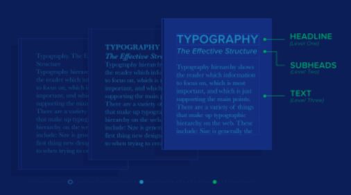
Take a look at the typographic structure.

A typographic visual hierarchy describes how letterforms are displayed and where they can most effectively catch the viewer’s eye. If you’re choosing a few fonts for your design, think about how they’ll work together. Set up your font pairings, such as which lettering should be displayed and which should be used for body text. Swap your styles around to find which one has the most stable structure.
Inquire about comments.
Show some mock-ups of your potential fonts to family and friends and ask for comments. Because you’re designing for a specific audience, enlist the help of people you can trust as a sounding board for your ideas. this way you will get an understanding of choosing colors and fonts for design.
Phone: 0495 272 2242